Image credit: Future PLC/James French
Renovations can be tricky at the best of times, but some properties present more issues than others.
When the now owners bought this house it was a complete wreck. Having been a student house for 40 years, the previous owner had carved it up into three flats so it was a dark and confused rabbit warren.
‘There was lino everywhere and a shower with a bin liner for a curtain!,’ recalls the owner. ‘I didn’t even notice the original stained glass window as it had been hidden by a huge kitchen sink and woollen curtains.’
However, they could see potential and were up for the challenge, even though the couple’s three children were ‘nearly in tears at the prospect of ‘the nightmare house’. Now it’s a sophisticated home designed for family life.
The exterior
Image credit: Future PLC/James French
Stud walls had been erected by the previous owner to create the extra rooms for the students, so all the fireplaces had been ripped out with small remnants of cornicing and coving remaining. The plan was to have the layout reconfigured closer to its original proportions, so it was all stripped back to brick.
One side of the house would originally have been four rooms, but it was split into nine. This space was opened up to create a kitchen diner and living room, with separate utility/pantry and cloakroom. The two rooms across the hallway were kept intact, and are used as a family/TV room and a study.
Upstairs a family bathroom and en suite for the main bedroom were created from part of a kitchen and utility, while a tiny single bedroom was turned into a dressing room.
Along the way the owners put back reclaimed fireplaces, reinstated cornicing, replaced plastic window ledges and uncovered shutters hidden under layers of paint.
The kitchen
Image credit: Future PLC/James French
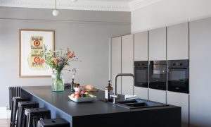
‘’This area was the rabbit warren of five rooms so we removed walls and a massive chimney breast to make way for the new two-piece kitchen,’ say the owners. ‘Our previous home had an Aga but I wanted a contemporary fuss-free design here with a black island and lighter neutral tones elsewhere. As there’s a hot water tap, there’s no need for a kettle, and a breakfast cupboard hides the toaster.’
The island is and worksurfaces are covered with Fenix. This innovative material has a non-porous external layer making it heat and scratch resistant. It can also be wrapped around drawers, cupboards and splashback areas for a seamless look, with a huge number of colours available.
To keep the island clutter-free, hardworking cabinetry conceals a fridge freezer and larder cupboards, along with two ovens, a microwave and warming drawer.
Although there are three different types of kitchen lighting ideas in the open-plan room, they’re all quite simple and feature white globes which tie them together.
The dining area
Image credit: Future PLC/James French
‘Our antique table looked lost here, so we bought a wider modern dining table,’ recall the owners. ‘Since it’s quite a long room, it’s permanently extended. The Penguin Harland Miller book cover artwork is actually a limited edition deckchair that we took apart and had framed.’
The living room
Image credit: Future PLC/James French
The owners had to get creative with furniture and accessories, so spent hours hunting for bargains on eBay, fairs and scouring reclamation yards.
‘We’ve always had a love affair with French antique furniture so we have a mix of traditional pieces and contemporary classics,’ they say. ‘This second-hand Ligne Roset sofa was found on eBay for just £400 and we had it recovered, while the Damien Hirst spot painting was a wedding present that everyone chipped in for.’
When pairing old and new – such as a contemporary modular sofa with an antique stool or modern art within a traditional frame – make it cohesive with unifying elements like gold and black.
Image credit: Future PLC/James French
‘This antique French fireplace had been lying in someone’s garden and was overgrown with moss,’ say the owners. ‘We bought and restored it with a stone cleaning kit. I also love the 15-year-old checked chairs which have worked in every home we’ve had.’
When decorating a fireplace interior, take note from this home by choosing a pattern, colour or texture that suits the age of the house and echoes another element in the room, such as the flooring.
One of the biggest expenses in this project the hardwearing oak chevron parquet flooring, but it’ll be down forever and will survive children running around and spilling things.
The family room
Image credit: Future PLC/James French
This space shows how small details can have a big impact, like this quirky living room paint idea. The vibrant 2cm thin line which highlights the picture rail and ties-in with the coral accents.
The landing
Image credit: Future PLC/James French
If you’re nervous about introducing colour with a decorative landing idea, a gallery wall is the perfect place to try it. There’s no particular theme here, but it’s held together by the consistent frames and the bright primary colours.
Introduce 3D pieces alongside standard prints, like a framed tile or star. Think outside the box with things you wouldn’t normally put in a picture frame.
The guest bedroom
Image credit: Future PLC/James French
The guest room doubles as a second study. A barristers bookcase contains coffee table books and a mirrored wardrobe opposite holds office files.
Add depth to a room like this one by painting skirting boards, window frames and doors a darker shade than the walls.
The bathroom
Image credit: Future PLC/James French
The vision for the bathroom was a 1920s feel with a black modern version of a roll-top bath, chrome towel rail and basketweave floor tiles. There are elements of pink running through the house so the feature wall with black border really lifts the space.
For a steamy humid environment like a bathroom, ensure prints are professionally framed with a sealed back so they don’t warp or go mouldy. Alternatively consider durable ceramic, glass or sculptural pieces.
The master bedroom
Image credit: Future PLC/James French
When decorating this bedroom, it initially had one dark featured wall before the owners decided take the plunge and paint it all. The panelled walls add texture and makes the artwork pop.
The dark curtains add extra depth, too. Stick to the same shade as your walls – when they’re drawn you’ll feel cocooned in the room as the curtains will feel like part of the wall.
Additional words by Karen Wilson
The post Tour this sophisticated home perfectly designed for family life appeared first on Ideal Home.


